Project Overview
Product pages were inconsistent and heavily text-based, making it difficult for users to quickly understand product features and evaluate suitability. This increased cognitive load, slowed decision-making, and led to confusion, hesitation, and lost sales.
The project began as a stakeholder request to improve clarity by adding images to a few best-selling products. Recognizing a broader opportunity, I proposed and designed a scalable system to standardize product page structures across the entire catalog.
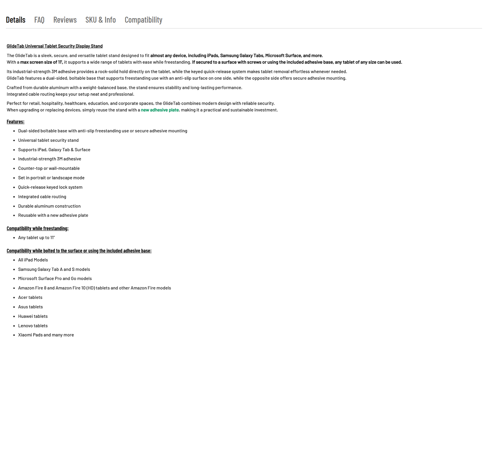
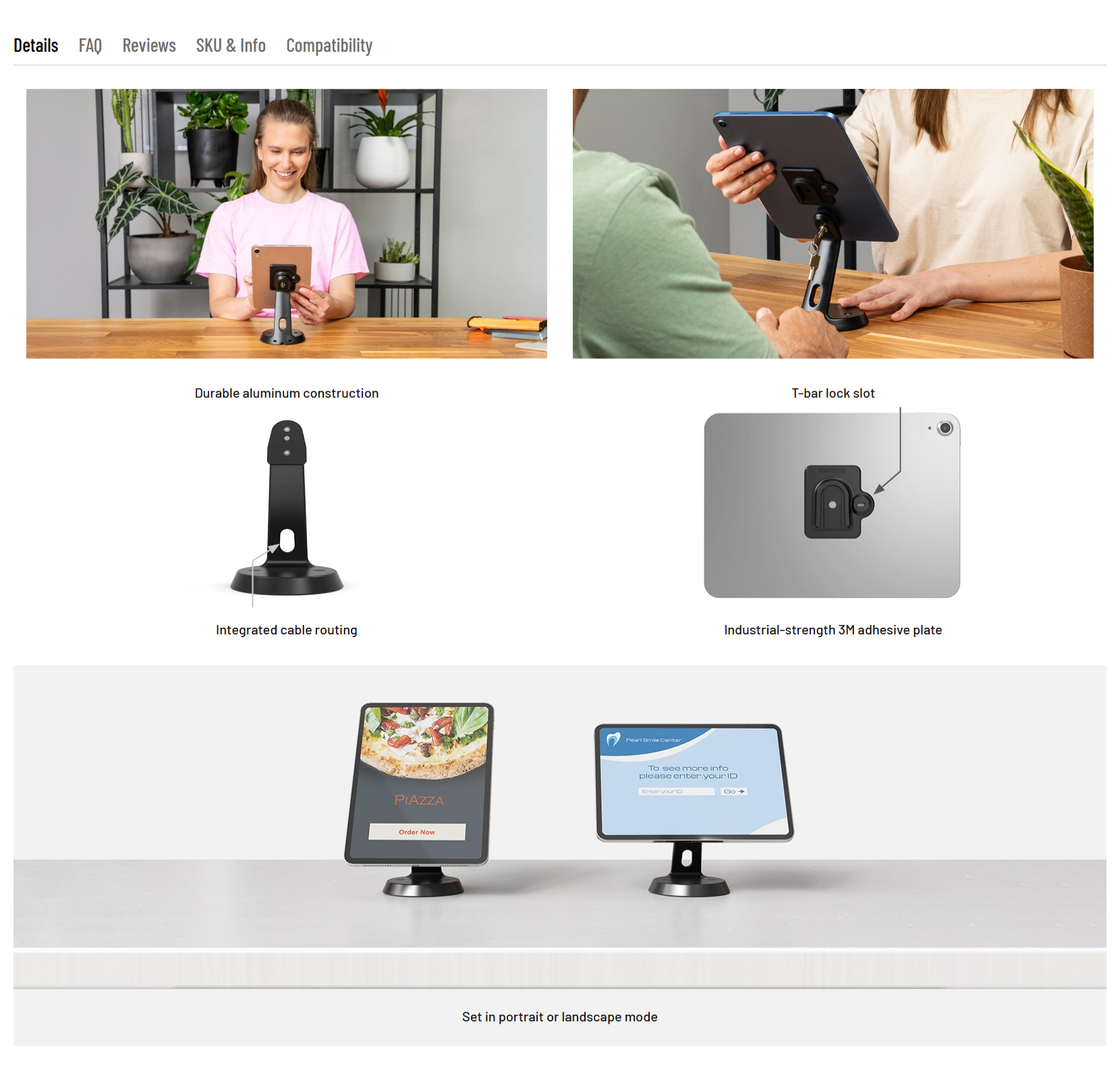
The primary users were B2B customers who relied on these pages to evaluate products independently. Existing descriptions were unstructured and difficult to scan, especially when explaining complex features. I focused on restructuring content into clear, repeatable sections, combining concise copy with visual elements. Text was treated as supporting captions rather than the primary source of information, making key features easier to grasp.

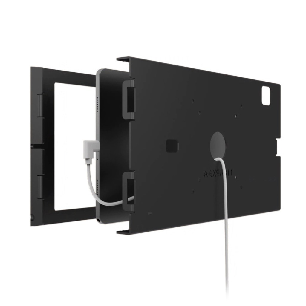
A key challenge was balancing clarity with brevity. I needed to communicate complex information in a compact format while ensuring consistency across diverse product types. I prioritized scalability over customization to support system-wide adoption, and performance over rich media to maintain fast load times.
To define what “good” looked like, I combined competitor analysis with internal insights from the Sales team, alongside patterns observed in other industries. The solution was also shaped by technical constraints, including CMS limitations, which required custom HTML/CSS approaches and lightweight video implementations with fallbacks.

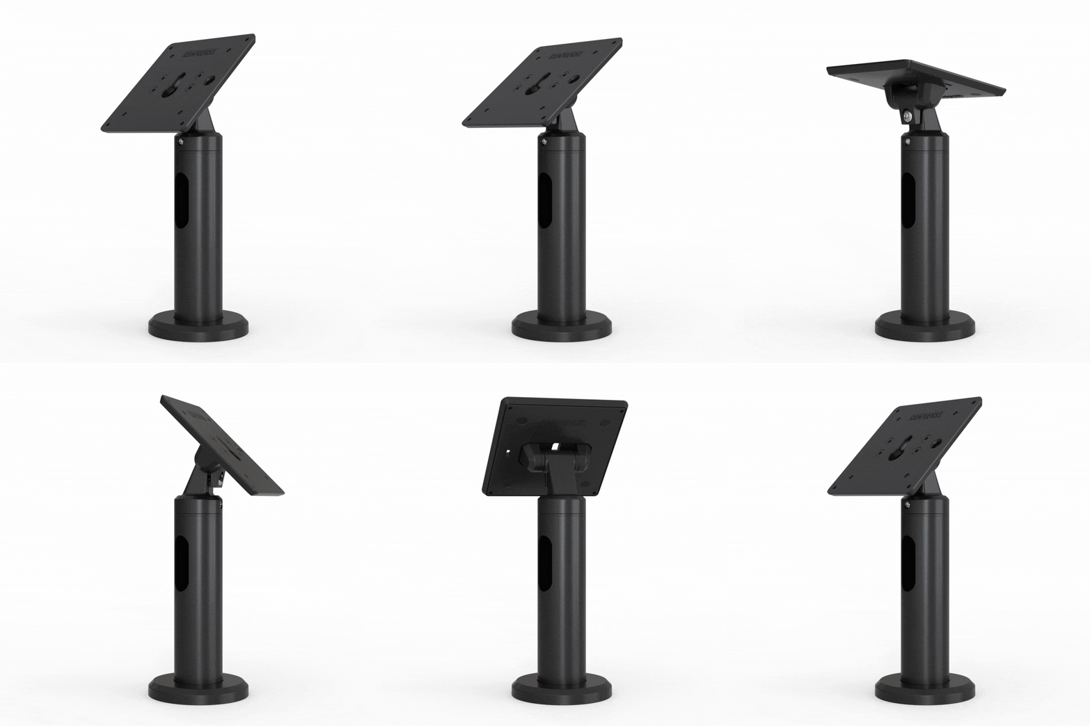
The system was initially applied to best-selling products, then expanded across 100+ product pages. It improved consistency and made pages significantly faster to create, even for non-technical team members. The Sales team reported fewer customer questions, while unassisted purchases increased, indicating improved clarity and user confidence. The system is now a standard part of launching new products.

